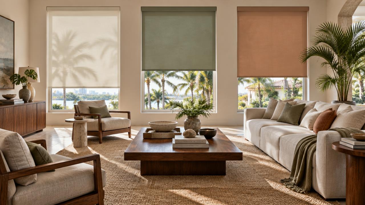
If you are choosing shades for a Florida living room in 2026 or 2027, the color conversation has changed. Cool gray and stark white are no longer the only way to make a room feel clean and modern. Current interior design reporting is moving toward warmer neutrals, earthy greens, clay tones, richer browns and softer blues. South Florida design coverage is showing a similar shift toward warmer, more natural palettes.
That does not mean every window suddenly needs to be olive green. A shade is part of the architecture of the room. It has to work with the wall color, flooring, furniture, natural light and the view outside the window. For a Florida living room, these are seven colors worth looking at.
The short answer: the strongest shade colors to consider for a Florida living room in 2026/27 are cream and warm taupe, sage green, deep olive or forest green, dusty sky blue, terracotta or clay, chocolate or walnut brown, and navy blue. The first six follow the broader warm, earthy direction of current interior design. Navy is the exception - it remains a classic and frequently requested choice, but it is not the direction the current color conversation is moving toward.
1. Cream and warm taupe - the easiest place to start
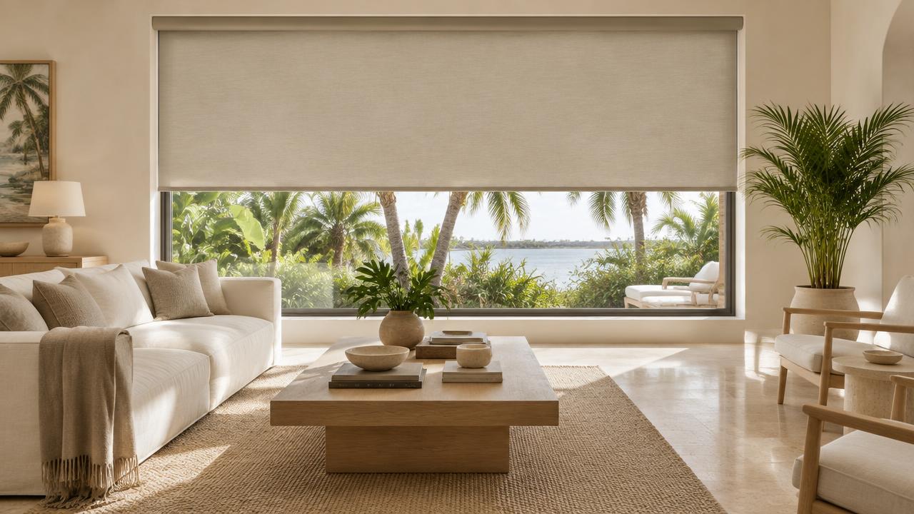
Cream, bone, ivory and warm taupe are probably the most versatile choices on this list. The important part is the undertone. A warm cream shade against a warm white wall can create a very quiet, almost architectural look. Instead of making the window treatment stand out, the shade becomes part of the room.
This works particularly well in Florida homes with: light oak or walnut furniture, limestone or travertine, beige or warm white walls, linen upholstery, large windows and lots of natural light.
The result is not "beige everywhere." The difference comes from using slightly different tones and textures rather than trying to match everything exactly.
Good for: a calm, neutral living room where the furniture, artwork or view should be the focus.
2. Sage green on warm white walls
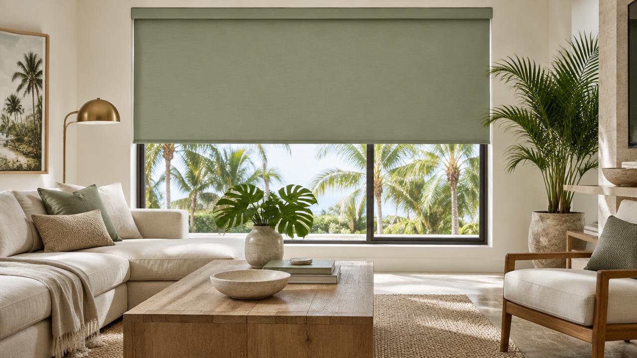
Sage is one of the easiest ways to bring color into a neutral room without making the window the first thing you notice. Current 2026 design reporting continues to point toward nature-inspired greens, including softer sage and more muted green tones.
In a Florida living room, sage works naturally with: warm white walls, natural wood, cream upholstery, stone, plants, brushed brass.
The key is choosing a muted green rather than a bright or highly saturated one. A soft sage shade can add color while still behaving almost like a neutral.
Good for: rooms that feel too white or flat but where you do not want a strong contrast around the windows.
3. Deep olive or forest green
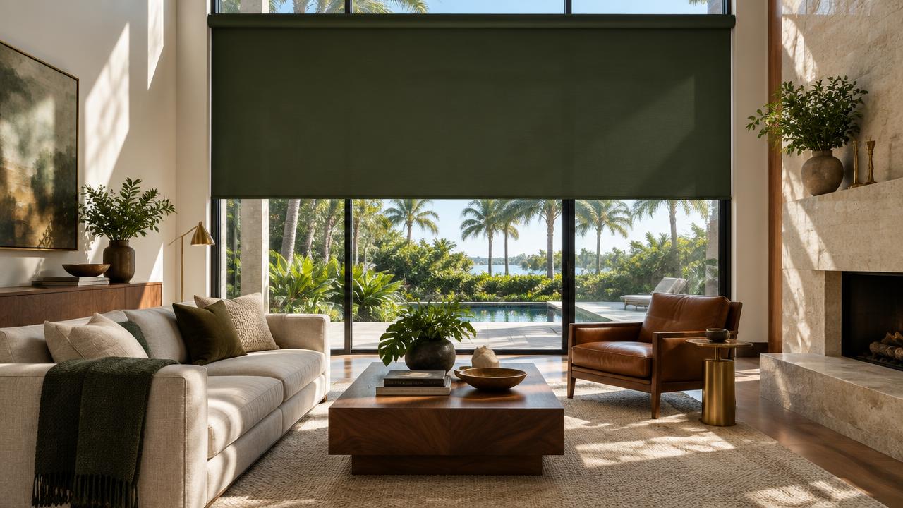
If sage feels too subtle, go deeper. Olive and forest green bring more weight to a room and work especially well when the rest of the interior already has warm materials. Think walnut furniture, darker wood floors, stone, leather, brass and large plants.
The advantage of olive is that it can function almost like a neutral. It has enough color to give the room character without behaving like a bright accent color. This also fits the broader 2026/27 move toward earthy, nature-inspired interiors rather than the cooler gray palettes that dominated earlier years.
Good for: larger living rooms where the windows can carry a little more visual weight.
4. Dusty sky blue
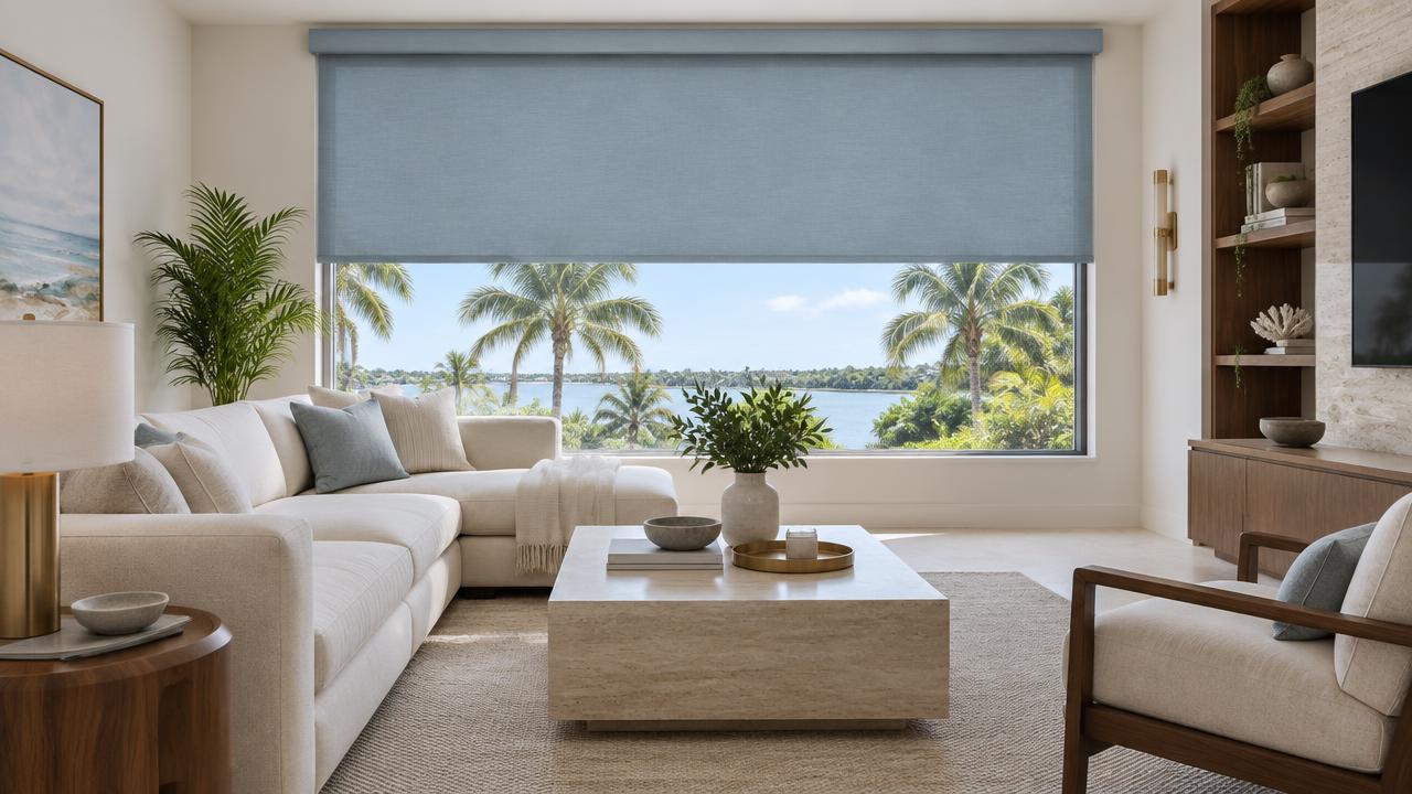
Florida and blue have always been an easy combination. The difference now is which blue. Instead of a bright coastal blue or a very dark navy, look at softer, slightly gray or dusty blues. This gives you some of the freshness associated with blue without turning the room into a traditional coastal interior.
Dusty blue works particularly well with: warm wood, cream, taupe, natural stone, aged brass, off-white walls.
It can also be a useful choice when the room already has a strong view - a muted blue can connect the interior to the sky and water without competing with them.
Good for: Florida homes with warm wood and a view that you want to keep as the visual focus.
5. Terracotta or clay
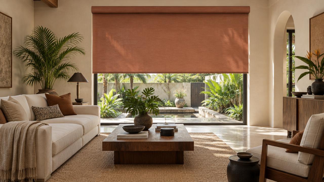
Terracotta is better used as an accent than as a default shade color. Clay and terracotta tones are part of the broader return to earthy colors in current interior design.
A terracotta shade can work beautifully when the rest of the room is restrained: cream walls, neutral sofa, natural wood, limestone, a few darker accents. You do not necessarily need it on every window - one or two openings can be enough to introduce the color.
There is also a practical reason to be careful with strong warm colors in Florida: intense natural light can make a saturated fabric look much stronger than it did in the showroom.
Good for: a neutral room that needs one deliberate hit of color.
6. Warm chocolate or walnut brown
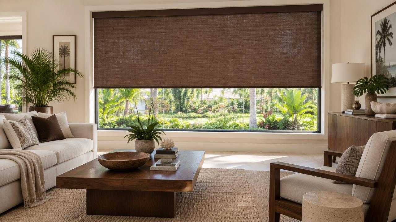
Brown is having a serious moment. Current 2026/27 design reporting is moving toward richer browns, from warm walnut to deeper chocolate and espresso tones. Several 2027 color forecasts are also centered around brown and other grounded earth tones.
For shades, brown works best when it has something else in the room to relate to - for example, walnut furniture plus a walnut-toned shade, or a warm wood floor plus a chocolate shade plus cream walls. The shade then feels less like a colored window covering and more like another material in the room.
Good for: warm, sophisticated interiors with wood, stone and natural materials.
7. Navy blue - the classic that did not disappear
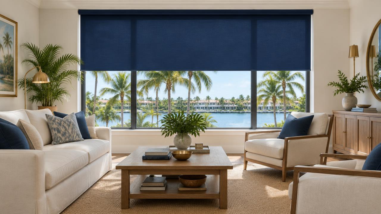
Navy is the interesting one. It is not the main direction of the 2026/27 color conversation - current reporting is generally moving toward warmer neutrals, greens, browns, clay and softer blues rather than strong cool contrasts. But that does not make navy a bad choice.
Navy is still a familiar, versatile color that works particularly well with warm white, cream, natural wood and brass. Unlike a very trend-specific shade, it has a long history in interiors. Choose it because you like navy, not because someone told you it is the trend of 2027.
Good for: a more classic Florida living room where you want stronger contrast around the windows.
Trendy does not have to mean temporary
There is an important distinction between a trendy color and a trend-driven room. You do not need to redesign the entire living room around the color of the year. The easiest way to make a shade look current without making the room feel dated in two years is to keep the overall palette restrained - let the shade be one considered choice within a room that otherwise stays simple.
One thing matters more than the color: Florida light
This is where choosing a shade for a Florida home is different from choosing a fabric from a small showroom sample. The same color can look completely different in morning light, strong afternoon sun, a shaded room, or artificial light at night. Florida's natural light can be particularly strong, especially in rooms with large west- or south-facing windows. That is why we recommend looking at the actual fabric in the room before making the final decision.
Color should not be separated from fabric selection. A living room may need to preserve the view and reduce glare. A bedroom may need darkness. A west-facing room may need stronger solar control. The color can be beautiful, but the fabric still has to do the job - the starting point should be what the room needs the shade to do, not simply which fabric looks best in a sample book.
Should every window in the house have the same color?
No. A Florida home can have a bright living room, a darker bedroom, a home office, a media room and a large sliding door - all with completely different requirements. There is no rule saying they need the same fabric or even the same color. The better question is: what does this window need the shade to do?
What about motorized shades?
Color and motorization are separate decisions. A motor does not make a fabric better at controlling heat, glare or light - the fabric, openness, coverage and installation configuration determine those things. Motorization mainly changes how easily and consistently you can use the shade. It can make particular sense for large living-room windows, wide sliding doors, high or hard-to-reach windows, rooms where the sun changes significantly during the day, and homes with many windows. A single easily reachable window may not need it. The point is not to motorize every window because you can - it is to make the windows you use difficult to ignore easier to control.
How to choose the right shade color
Start with these four questions: What color are the walls (look at the actual wall, not a paint-card name)? What are the main materials in the room (wood, stone, flooring and upholstery often tell you more than the paint color)? How much natural light does the window get (the same fabric can look very different in morning and afternoon light)? What does the shade need to do (view, glare control, privacy, heat control, or darkness)? Only after those questions would we choose the exact shade color.
FAQ
What are the most popular shade colors for Florida living rooms in 2026/27?
Warm cream and taupe, sage, olive, dusty blue, terracotta, chocolate brown and navy are all useful options. The broader 2026/27 interior direction is moving toward warmer neutrals, earthy greens, richer browns and clay tones, while softer blues remain useful as a cooler counterpoint.
Are gray shades out of style?
Cool gray is no longer the dominant neutral it was in previous years. Current design reporting is showing stronger interest in warmer taupes, creams, browns and nature-inspired neutrals. That does not mean every gray room is dated - undertone and the rest of the palette matter.
What shade color works best with white walls?
Warm white walls generally give you the most flexibility. Cream, taupe, sage, dusty blue and even navy can work. The important detail is whether the white itself is warm or cool.
What shade color works best with wood furniture?
Cream, taupe, sage, olive, dusty blue and chocolate brown all work naturally with wood. The exact choice depends on whether the wood is light oak, walnut, or something in between.
Should living room shades be light or dark?
Neither is automatically better. Light shades tend to blend into a bright neutral interior, while darker shades create more contrast and can become part of the room's visual composition. The right choice depends on the room's palette and how much visual weight you want around the windows.
Does the shade color affect heat control?
Color is only one part of the equation. Fabric type, openness, glazing, coverage and installation also affect solar performance. Motorization can help because it makes timely operation easier, but the motor itself does not make the fabric more effective.
Should I choose the shade color before the fabric?
Usually, no. Start with what the room needs the shade to do, then choose the appropriate fabric and performance characteristics. Once you know the right fabric family, choose the color that works with the room. That is particularly important for Florida living rooms with strong daylight.